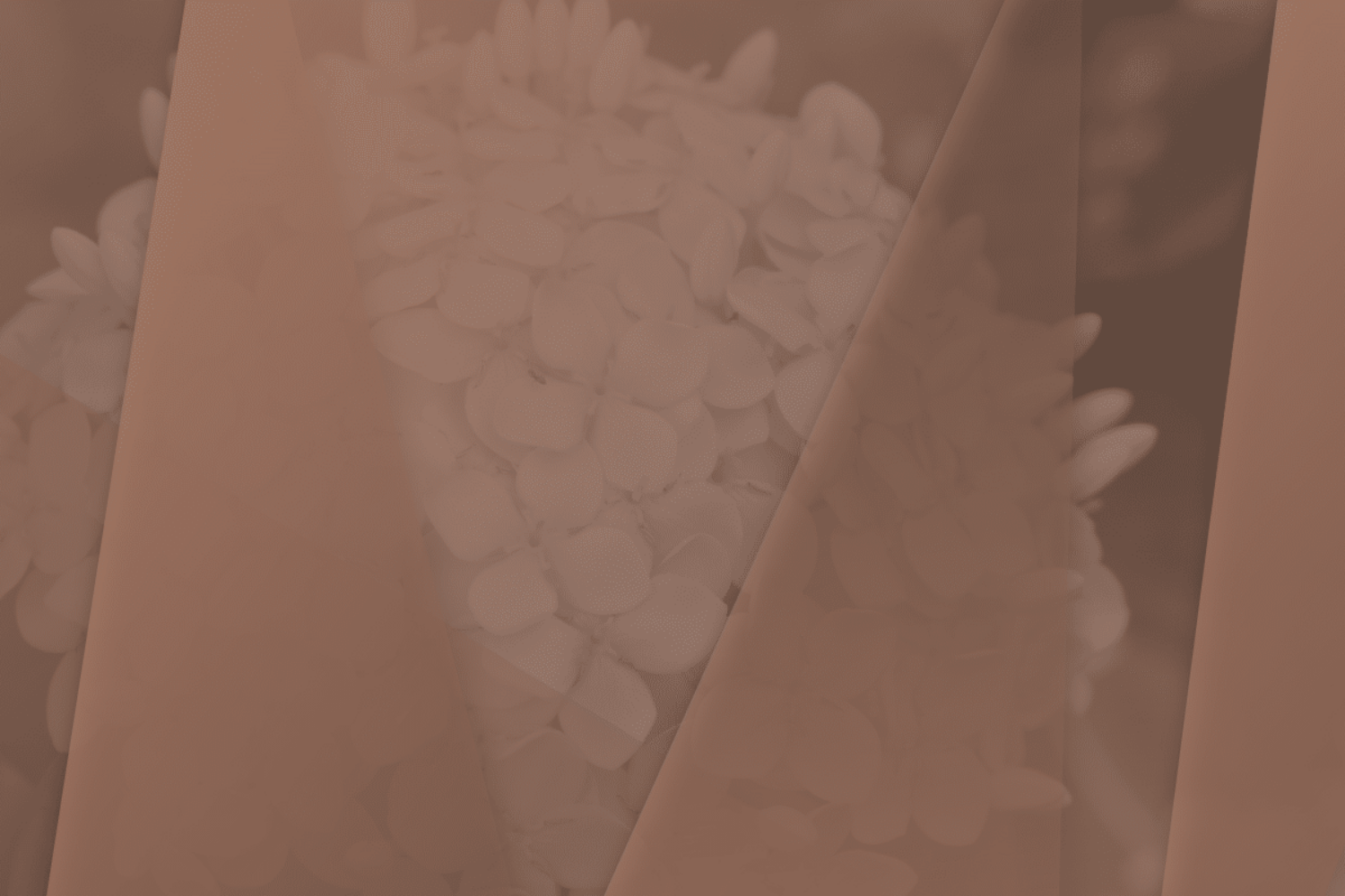
 Pantone’s Color of the Year for 2025, PANTONE 17-1230 Mocha Mousse, is turning heads—and not always in the way you’d expect. While some critics dismiss it as mundane or too subtle, we at Design5sixty4 see its potential as a graphic design powerhouse.
“What do you think of the new Pantone color, Lori?!” — a question coming this way in a few conversations. And quite honestly, on the onset, my response is “it’s an interesting choice” with further explanation that I need to dig into this and understand the motivations behind the selection. And so, I dug in, played with it a little, and I LOVE it! Let me explain…
Why Mocha Mousse Works for Graphic Design
This warm, rich brown might seem understated at first glance, but that’s precisely where its strength lies. Mocha Mousse offers versatility and grounding designs in a timeless and sophisticated way while giving space for bolder elements to shine. Its color invites balance—a crucial quality in creating compelling visual identities.
Elevating Branding with Mocha Mousse
For branding projects, Mocha Mousse communicates stability, warmth, and authenticity. It works beautifully in earthy, nature-inspired palettes and pairs seamlessly with accent colors like terracotta, deep olive green, or soft blush pink for a modern edge. This shade can bring a sense of approachability and depth to logos, typography, and packaging.
Mocha Mousse in Digital and Web Design
Digital spaces thrive on accessibility and clean visuals, and Mocha Mousse provides a neutral but engaging background, highlighting other design elements without overpowering them. Pair it with white or off-white text for legibility, or contrast it with brighter colors to create a visual hierarchy.
Print and Marketing Materials Get a Boost
Mocha Mousse offers as a beautiful base for materials like brochures, business cards, and posters in print design. Its color invites tactile associations—such as rich paper textures and luxurious finishes. It can elevate a design from professional to premium when paired with metallic foils or matte overlays.
A Color to Inspire Creativity
At its core, Mocha Mousse is adaptable. This color can play as a core color choice or the supporting role. Easily becoming a foundational option in a variety of project ‘landscapes’. Here are some palette explorations and pairings for inspiration via Pantone Connect:


Mocha Mousse invites us to rethink how warmth and subtlety can lead to impactful, memorable designs. As we move into 2025, embracing this hue means leaning into its calming presence and using it to create designs that resonate emotionally and visually.
Pantone’s pick isn’t just a color for the creative industries; it’s an opportunity. Let’s welcome 2025 with open arms—and an open palette!

